1. Contrast and Dimension
Contrast and dimension are two of the best ways to create and establish a visual hierarchy in your design. A good composition contains one dominant element. The chief component of your design is the point of attention, which attracts the eye; it is the first thing the viewer notices when observing your art. It is crucial to have one dominant element / one main focal point of your design to create a sense of balance, purpose, and cohesion. When one fails to create focal points, too many different elements compete for attention, making a chaotic and visually displeasing composition.
So, when laying out your composition in the initial stages, ask yourself, “What do I want to be my main focal point? Where do I want the viewer’s eye to travel first in this design?” Is it the type? A symbol? A photo? Design element? Of course, you can, and typically do, have more than one focal point in your design, like an ornament and the words “Happy Holidays” on a holiday card, but, of these focal points, your design must have one primary dominant element and a clear visual hierarchy.
So, how do you make your dominant element stand out from the other parts of your design? That’s where contrast comes into play.
Say your dominant element is text and you have a dark background, you’d want to make your text contrast against the dark background – the most obvious way to achieve this is to select a light or bright color for the text element so that it contrasts against the dark background.
Still doesn’t stand out enough? That’s where dimension can help. Adding a drop shadow or other three-dimensional effect to your text or another focal point can further help it stand out from the background and add more dimension to your design. Remember that you don’t want too many competing points of attention in your design, as that will completely negate your contrast. Therefore, you don’t want to apply drop shadows to too many elements. If you do have drop shadows or other effects on multiple elements in your design, make sure that it is more pronounced on your dominant element and subtler on the others. For example, you can increase the opacity and the distance of the drop shadow on your dominant element to make it stand out; this will make it seem as though your dominant element is in the foreground of your design and the other elements recede into the distance. Using this strategy will make this element “pop out” at the viewer.
You can also use color and texture to achieve dimension and contrast, as we will explore in the following paragraphs.
2. Complementary Colors

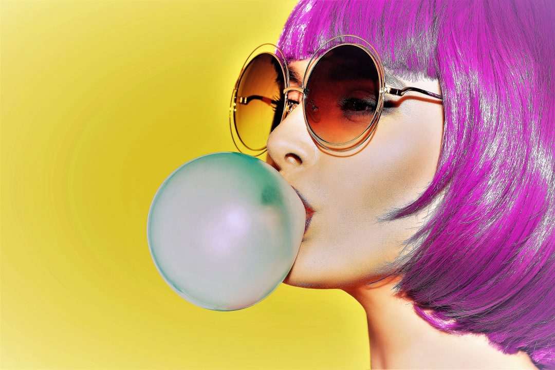
Complementary colors are those that are opposite one another on the color wheel. It may seem counterintuitive, but color theory is further proof that opposites really do attract, for the colors that are direct opposites of each other, also known as contrasting colors, are compliments. Examples include red and green, yellow and violet, and blue and orange. Have a deep blue background and want to add some element that really “pops”? Try adding some elements that are somewhere on the spectrum of the color orange. It does not have to be the pure hue; for example, a deep blue background with some elements in a pastel orange or even an analogous color like yellow-orange on top can have a striking effect.
And this is not mere conjecture; there’s actual science behind why the pairing of complementary colors seems to both soothe and balance. Perhaps you may recall from grade school science class that the color we perceive an object to be is actually the wavelength of light reflected at us. So, a red apple absorbs the full spectrum of light except for the red wavelength; therefore, we perceive it as red. If it were to absorb the full spectrum of light, it would appear black to us, and if it were to reflect the entire spectrum, it would appear white.
The retina in the eye, which is considered part of the brain, contains different types of photoreceptor cells. These photoreceptor cells vary in the wavelength of light they are most adept at perceiving. So, complementary colors are so pleasing to the eye because they are simultaneously stimulating different parts of the eye.
This explains why complimentary colors play off each other’s intensity; blue appears bluer when paired with orange and vice versa; they enhance one another. The eye is more drawn to these colors when paired together. Thus, complementary colors are another great way to create contrast and visual interest in your design.
3. Texture
Have you ever been working on a design and feel like it looks bland or flat like it’s just missing something? Sometimes all that’s needed is a bit of texture. Texture can help add a sense of realism to your design, a tactile element, and more visual interest.
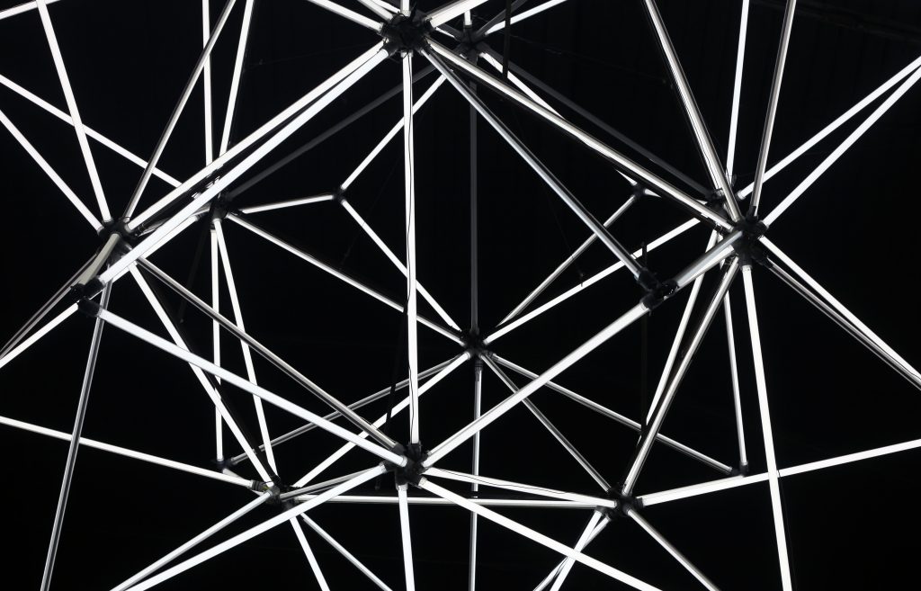
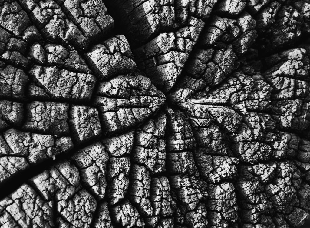
Textures can include all different types of patterns, lines, structures, textiles, papers, and organic textures found in nature like wood grain, leaves, and more!
But remember the first principle of contrast? That’s important here too. If you have a more detailed, rich, or “busy” texture in the background, it is best to keep other textures applied to foreground elements subtler or simple, or vice versa.
Contrasting many textures can work, but be careful not to overdo it. If you added many textures and find that your design is looking busy or chaotic, try removing or reducing the texture’s opacity on your background or foreground elements. Sometimes using subtler textures can be the most effective technique, especially in creating a sense of realism. The textures that we encounter in the real world are often more nuanced – things that we don’t notice that we’re noticing, if that makes sense.
In conclusion, the use of texture and color in your design are two of the most effective ways to create contrast and dimension. These elements can skillfully make a design “pop” and capture attention while also maintaining a sense of balance and harmony in the composition.
If you need help on your next 123Print project, contact our design team. Good luck!

No Comments