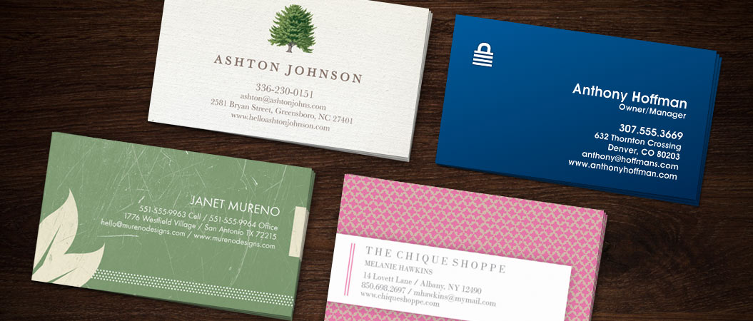
Designing your first custom business card? Getting ready to recorder a more swanky version of your current business card? Don’t give your business cards the opportunity to be ineffective before you even hand the first one out. Read on for 10 common mistakes people make when designing their personalized business cards.
1. Font Choice
Don’t go font crazy – pick one font, and stick with it. Also, avoid fonts that mimic handwriting as they will make your business card more difficult to read than others that have standard, typeset fonts.
2. Font Size
Not too big, not too small – justtttt right.
3. Whitespace
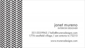
 Contrary to what many believe, whitespace is a good thing. Whitespace can help draw the eye to what’s important at first glance, such as your name or contact information. Filling your entire business card with words or images will make it look too cluttered, even if it looks good to you. Something good to remember? Don’t make people have to stop and think when they’re reading your card – just let them read it. Even if your company has hit some amazing milestones as of late, you’ve earned some noteworthy certifications, you have some important dates coming up – refrain from including them as this will deter people from even reading your business card. If you must, consider using a double-sided business card and putting that info on the back.
4. Contrast
Limit your color palette when creating your business card, as having too many colors can decrease your card’s readability. Also, make sure that the color of your text contrasts with the color of your background. No blue on red or anything like that … ick!
5. Group Similar Things Together
The traditional way that business card info is presented has been around forever – so why try to reinvent the wheel? People will know where to look for the info they need. As innovative as it may look to have your name in one corner, phone number in a second corner, your email in a third corner, etc., this will make your business card confusing! Try to keep your information in this standard order and your card will be much easier to read:
Name
Title
Company
Contact Info
6. Remove Uncertainty
If you’re going to list, for example, a phone number and a fax number, make sure each one is labeled. If your company does business internationally, make sure you add the country code to your phone numbers, and list the country with your address. Never make it hard for people to contact you.
7. Be Mindful of Social Icons
I know it sounds silly, but just because a Facebook icon is easily clickable online, this does not translate to your paper business card! People are still just putting the Facebook or Twitter icons on their card, without listing the corresponding URLs. It’s great to let people know you’re on Facebook, but make sure they can find you!
8. Use Your LinkedIn Public URL
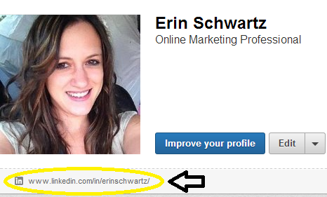
When providing a link to your professional LinkedIn profile, a mistake many people make is copying and pasting the URL straight from the URL bar – a format that generally looks something like http://www.linkedin.com/profile/view?id=96313089&trk=nav_responsive_tab_profile. Instead, look on your actual LinkedIn profile for your public profile URL, located underneath your picture. This URL will be much more user-friendly, and will look something like www.linkedin.com/in/erinschwartz.

9. Unusual Shapes and Sizes
Having a unique shape to your business card may be appropriate for some industries (i.e. creative industries) but for many, having a standard, 3.5” x 2” card will suffice. If you want your card to stick out while keeping standard dimensions, try a raised-ink business card for a sophisticated look and feel!
10. Company Logo
Unless your work for a Fortune 100 company, chances are people won’t be able to recognize your business just by looking at its logo. If your logo doesn’t clearly state your company’s name, make sure it is listed either above or below.
Can you think of any other common business card mistakes people make? Let us know in the comments below, on our Facebook page or tweeting @123Print.

