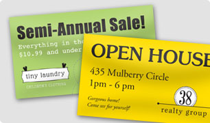
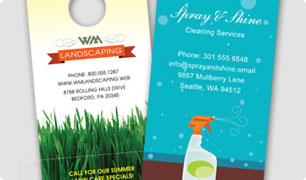
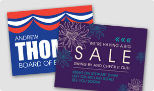
 When it comes to outdoor advertising, let it all hang out! What do we mean by that? Be yourself. Be loud and proud. Make people want to shout your brands name from the rooftops! BUT do it all with a purpose. Whether you are designing a custom outdoor banner or yard sign, getting ready to be on the move with a custom car magnet, or letting it hang with a door hanger, your message must be clear. Check out these tips to assure a firm foundation with your outdoor marketing materials and you will be a lot better off than most outdoor advertisers out there!
1. Don’t use excessive verbiage. Especially when it comes to marketing materials that someone will see when driving. Even if they’re at a stop light, most people won’t even want to read your message if it’s too long. In the words of the now infamous Sweet Brown, “Ain’t nobody got time for that!”
 2. Use relevant images. Advertising your law firm? No one wants to see a picture of your adorable dog. Make sure that the purpose of your images is to set the tone or illustrate your concept. And unless you have a compelling reason, your picture doesn’t need to be included either.
3. Use bright colors appropriately. There is a time and place for bright colors, and perhaps it’s relevant for your message. But, most of the time, outdoor ads get attention because they’re strategically laid out and well-designed. If you rely on bright colors to get your message across, you may come off as sleazy.
4. Use one point of contact. Including your phone number, email address, address, directions and your website is unnecessary. Highlight one form of contact. If your ad is compelling, people will seek out your company.
5. Avoid using “bursts.” These could make you appear cheap. If something is so important it needs to be called out, make it the main message of your ad.
 6. Don’t use system fonts. Fonts like Arial, Impact and Times will make your ads look generic and may make you look uncredible. There are much better fonts out there that can give your ad a touch of personality. Google Fonts has tons of free fonts you can download right onto your computer.
7. You don’t always need a call to action. Phrases like “Buy now!” “Turn here!” or “Get more info!” can be redundant. Your entire ad serves this purpose! As long as your ad evokes an emotional response, your audience will decide their own call to action.
 8. Pay attention to your audience. Know who your ad speaks to and use a matching tone. Your target audience can’t be everybody. The more focused you are, the more sales you’ll make.
9. Don’t rip off national advertising campaigns. Remember the “Got Milk” campaign? Just because the “Got Milk” message was effective for the California Milk Processors Board, it doesn’t mean it will also be effective for you. Though it may grab people’s attention, there will be nothing unique about your business worth remembering.
10. Once you’ve mastered the rules, you can break them. Just make sure you have a very deliberate purpose and a strong concept. Think about it this way—if your concept will only work by breaking the rules, you’ve probably got a remarkable ad campaign on your hands.
Have you had any success using outdoor advertising for your business? Let us know your story in the comments below.
