Explore the power of color in print marketing. Learn how vibrant designs enhance brand recall, the psychology behind choosing hues that influence customer decisions, and why consistent color use is critical for building trust. Whether you’re designing brochures, business cards, or banners, discover how mastering color can elevate every deliverable.
Before creating print marketing materials for your business, it’s essential to understand what color psychology is and what each color represents.
Red
Red is an energetic color that commands attention. It signifies strong emotions, like love or anger. It can initiate a passionate customer response and is not soon forgotten. It can represent peril or urgency, but also power, importance, and strength.
Orange
Ensure an enthusiastic response from your customers by honing in on their creative and adventurous spirit with strategic uses of orange. This color can be very optimistic, representing health, energy, and vitality, but it can also express caution more moderately than red.
Yellow
Depending on how you use it, yellow can be a beacon of hope and positivity for your customers. It can also be a warning sign of illness and danger, while not as threatening or overwhelming as red. Think of a sunny afternoon versus a swarm of angry bees or a lovely daffodil versus jaundiced skin.
Pink
While traditionally feminine, pink can represent soft and playful scenarios or sentimental or romantic encounters. It is a youthful and tender color with cheerful undertones.
Green
Growth, prosperity, and harmony are at the forefront of this fresh and peaceful color. But, be careful, green can also elicit a feeling of envy in certain situations.
Blue
Blue can be calming and sometimes somber. It can represent wisdom and instill trust while prompting loyalty.
Purple
This color can make us think of royalty or spirituality, and can have a mysterious or magical connotation. Purple can also represent creativity, intuition, redemption, and even enlightenment.
Brown
Organic and wholesome, brown can represent you simple, honest, and traditionally dependable nature.
White
This peaceful color typically represents purity, clarity, innocence, and cleanliness. It can also signify impartiality.
Black
Black is a sophisticated color that can be formal, luxe, and even mysterious. It can also represent sorrow, death, and the unknown.
Colors can mean different things to different people based on personal experiences, region, religion, and other beliefs. Certain color meanings can also change from generation to generation, and current events can also play a role. For example, in the US black typically represents death whereas in China it’s white. A personal experience can also change one’s perception of a color, for example, a traditionally peaceful color like green could have an opposing psychological impact if, say, someone was hit by a green car. A rainbow-colored garment can mean one thing to some of the LGBTQ community and something totally different to another. Research your demographics and plan accordingly.
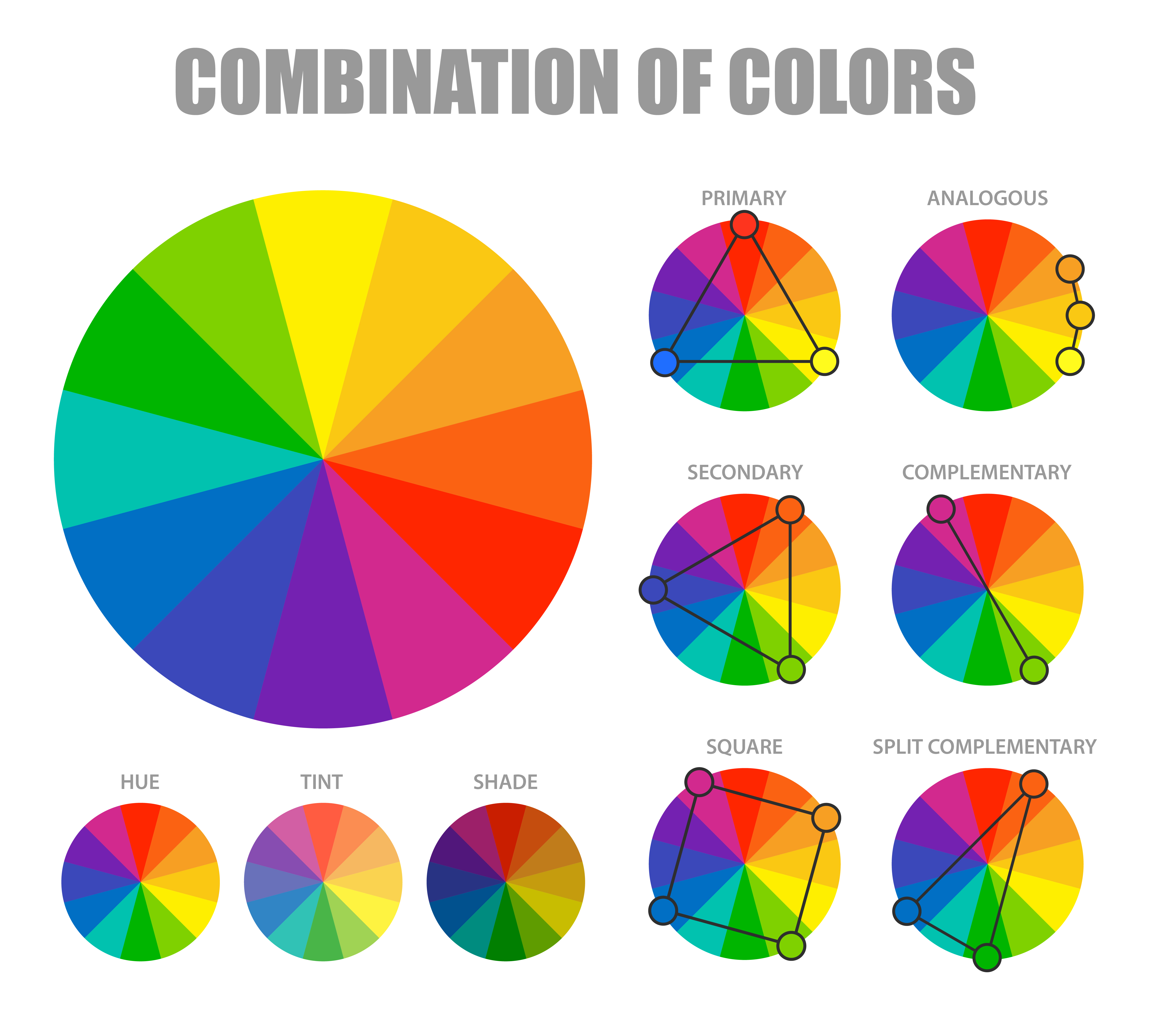
There are certain strategies you can use for combining colors on your print marketing materials.
For quality print marketing materials that are sure to grab attention, check out 123Print!
If you use a color scheme consistently, people will begin to associate your business with those colors. Right before cigarette ads became heavily regulated, a brand named Silk started using the color purple prominently in their marketing, by the time the strict regulations went into effect, customers would see the color purple without so much as a mention of a cigarette and think about lighting up with their favorite brand. What brand logos stick out in your memory? Think about their colors and what they mean to you.
Think about the descriptors that define your brand identity and customer base. Are you an eco-friendly company that promotes balance and peace? Are you a luxury brand with timeless sophistication? Are you a wholesome brand or are you a spicier, uninhabited business? Are you more professional or carefree? Do you have a more masculine or feminine energy? Determining your brand voice will help you choose colors representative of that message. And, not every deliverable is the same! Sometimes your ads will promote one message and other times another, but make sure you keep your core values consistent.
Use a darkly-colored typeface on a light background or alternatively a lightly-colored font on a dark background. Try and limit your palette to a primary color, a secondary color, and an accent color for an uncluttered appearance. Follow the color meanings above to create CTAs, clickable buttons, headlines, and more, that suit your needs. Remember, red commands attention and signify urgency while peaceful colors like blue showcase trust.
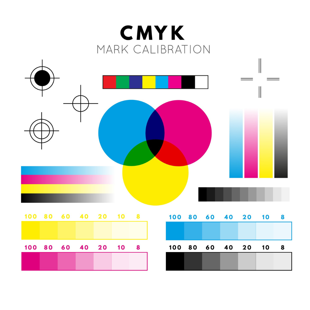
After researching your demographics and designing your ad, you’ll need perfect color matching when printing your print marketing materials. Ensure all deliverables are printed at a reputable company that use the color model CMYK (Cyan, Magenta, Yellow, and Key (black)), which is better for printing. Test design variations with your customers and prospects to see which ones perform best, and optimize accordingly.
The experts at 123Print can help you to create truly remarkable marketing materials that are guaranteed to bring in more loyal customers. Talk to someone today!
Boost spring event attendance with smart print and digital marketing. Learn how to effectively use…
Learn how strategic print materials can help turn 2026 goals into focused plans, consistent branding,…
Give clients more than a discount this season—show genuine gratitude. Explore how personalized print marketing,…
Customer service in America has declined, which can become especially frustrating during the holiday season.…
Learn why tariffs are impacting business marketing in 2025 and how to adapt to these…
Is your brand due for a refresh? Explore our expert guide on revitalizing your business…