Typography is often considered to be the most important element in a design. The skillful use of typography can elevate a simple photo or logo into something extraordinary. And, conversely, the “wrong” typeface and font choices can obscure the intended message or create a sense of discord in the composition.
The selections of multiple fonts within a design should balance the elements of contrast and cohesion. For decades, the consensus among designers for the combination of fonts that typically works best is pairing either a sans serif with a serif font or a script font with a sans serif or serif font. The reason that these pairings tend to be the most effective comes down to one of the most critical elements in any composition: contrast. It is vitally important not to use fonts that are too similar, as this can appear like an unintentional mistake. Yet, equally important in achieving a visually appealing layout is a sense of cohesion. You usually want to stick to no more than three different fonts within a design. You want to select fonts that appear to “fit together” in a way, whether that means they simply complement each other or have some similar qualities. Think about using different vintage-style typefaces together to create a retro aesthetic or handwritten-style typefaces together to create a handmade aesthetic.
The Basics
In case you’re a novice to some of these terms, let’s go over them a bit. Serifs are small finishing details at the start and end of letterforms. The infinitely ubiquitous Times New Roman is a serif font. I apologize if I just evoked flashbacks of typing up essays in 12pt Times New Roman in grade school at the mere mention of this typeface. Serif fonts are considered the most traditional fonts and are still a common choice for blocks of text, especially in books and newspapers, as they are considered to be more the more legible font in print.
However, the choice of a serif font for body copy on the web is becoming increasingly rare, as that’s considered to be the domain of the sans serif fonts. Sans serif fonts are simply fonts without those snazzy little projections at the end of the letterforms. These are generally considered to be more clean, modern, and legible. In this category, we have ever-popular Arial and legendary designer go-tos like Helvetica and Futura.
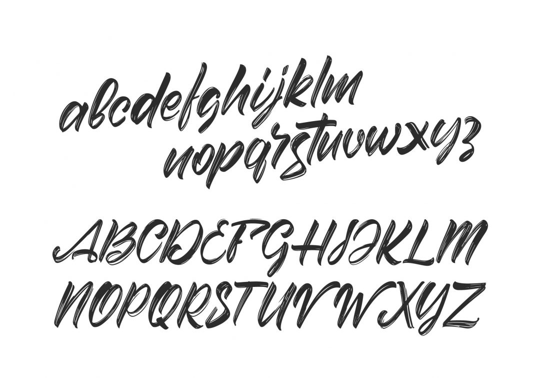
Then, we have what I consider the “show-stoppers”: script fonts. Script fonts are considered “display fonts,” meaning they are intended to be used at larger sizes as titles, headers, and art elements and not ideal for copy blocks. Sometimes called “handwriting fonts,” script fonts have connected letterforms that mimic handwritten calligraphy; they range from formal classics like Bickham and Kuenstler to the more casual and expressive ones like Carolyna and Bickley. While each of these font categories has a considerable amount of variation, it’s easy to see why a pairing like this is so effective. Observe the sweeping, delicate flourishes of the script font Carolyna next to the clean, austere precision of the geometric sans serif Futura; the stark contrast naturally captures attention and highlights the distinct personality of each font. This relationship lends well for emphasizing certain words or phrases within a composition.
Rule 1: Create Contrast by Using Typefaces from Different Categories; Combine No More Than Three Fonts to Maintain Cohesion
As mentioned previously, it is vital not to use typefaces that are too similar, as this can look like an unintentional error. You want to create purposeful contrast in your design while also generating a sense of cohesion. You want to create just enough visual tension that captures the eye and establishes a visual hierarchy without being chaotic or illegible. For this reason, it’s usually best to stick with combining no more than two to three different fonts.
Pairing fonts can often be a delicate balance, but don’t fear. There are some popular “cheat codes” that designers often employ.
The “Cheat Codes”
1. Superfamilies
The first “cheat code” is to stick with just one font family, leading to a cleaner, more minimalist layout. Superfamilies are font families with many weights and styles within the same typeface; they can include variants of the font at different stroke weights, with and without serifs, as well as bold, italic, slab, rounded variations, and more. For example, Lucida is a popular superfamily containing as many as twenty different font variations, including sans serif, serif, bold, demi-bold, italic, typewriter, and handwriting variants and combinations. Therefore, you could use just two to three different variations of Lucida within your design, and rest assured that the fonts will pair nicely together.
2. Typefaces Designers & Font Duos
Alternatively, you can use multiple typefaces from the same designer or find font duos online that other designers have already paired together. You can search font duos or search fonts by individual designers on any popular font website. Designers often have a consistent style and vision throughout their different type designs. Selecting a sans serif and serif or script font from the same designer often naturally creates that balance of similarity and contrast.
Rule 2: Select Typefaces Based on the Aesthetic You’re Trying to Achieve
Still struggling to find the right fonts? Don’t worry! A lot of it comes down to trusting your gut, experimentation, and practice. A great place to start is to decide the theme or aesthetic you’re trying to achieve and what words you want to emphasize the most. Is the style of this design traditional and classic? Ultra-modern and sleek? Handmade and crafty? Once you’ve determined the aesthetic you’re aiming for, select a font that best represents that style and build around it. If you select a font that’s very ornate and intricate, it’s usually best to pair it with another font that’s minimal and clean. For example, suppose you select the decorative qualities of Daughter Script (one of my personal faves); you might pair it with the sensible, traditional qualities of Minion Variable Concept and let Daughter Script be the star of the show.
Rule 3: Adjust the Tracking or Use Glyphs to Balance and Elevate Your Design
if you still feel like your composition needs a bit of pizazz after you’ve meticulously selected the fonts and typefaces, you can always turn to my two secret weapons; glyphs and tracking selections. Glyphs are a specific shape, design, or representation of a character. If you’re using graphics software, like Adobe Illustrator (my recommendation), you can often find more elaborate and enticing letterforms in the glyphs window. My favorite typefaces with the most exciting glyphs options include Daughter Script, Burgues Script, and Samantha Italic SWASH. Tracking is the term for letter-spacing in typography. Not to be confused with kerning, tracking adjusts the letter-spacing uniformly over a range of characters and determines the visual density of a word, phrase, or paragraph. When is it most useful? Well, for one, it can be used to create more contrast between fonts. Do you have a header that’s bold and condensed? This can sometimes pair nicely with a font that’s light or medium-weight with more spacing between letters. It can also be useful when stacking words in different fonts on top of one another to achieve a more similar width. Say you’re using a script like Lambresia; this script is long and extended with long strokes between letters, so you may want to increase the tracking of the sans serif or serif font you’re using on the word or phrase beneath it to match the widths more closely.
Bonus!
Here are some favorite combinations of typefaces from the designers on our staff!
- Aphrodite and Century Gothic. The sumptuous curves of Aphrodite pair nicely with the sleek, straight-forwardness of Century Gothic.
- Eras-Bold and Northwell. We love combining the bold ultra-modern aesthetic that Eras-Bold offers with the effortlessly chic hand-written quality of Northwell.
- Venetian and Burgues Script. The refined, constrained nature of Venetian pairs beautifully with the opulent decadence of Burgues Script.
- Christmas Wish Script and Modern Sans. The ultra-modern geometric look of Modern Sans is an intriguing combination with the casual calligraphic style of Christmas Wish.
- Bickham Script and Trajan Pro. This submission came from John Lefler, who is both a Sales Manager and Designer on our team. As he put it, this combination is “official without being stodgy and elegant without being ostentatious.”
In Summary
When combining fonts, there aren’t many strict hard-and-fast rules. Much of it comes down to experimentation and practice. However, the combination of script fonts with a sans serif or serif font or the combination of serif and sans serif fonts is tried and true. Remember, it’s generally better to stick with just two to three different fonts maximum to create contrast and cohesion, not chaos. When in doubt, you can employ “cheat codes” like using different fonts from the same family or same designer or looking up popular duos online. And, you can always add some extra “razzle-dazzle” with the glyphs panel or by adjusting the tracking and kerning. Happy designing!
For more design ideas, go to 123Print!


No Comments