*We have some exciting news! You have the opportunity to win hundreds of dollars in prizes and become an official published photographer by having one of your photos featured on an exclusive 123Print product! Some of the loveliest greeting cards simply showcase the natural beauty of the seasons, so we’re calling on all our customers to submit your favorite fall or winter photos. For more details, click here.*
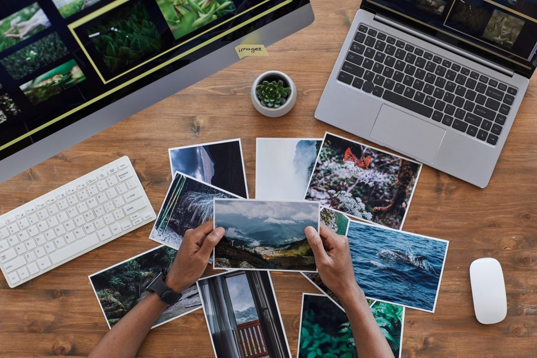
With that being said, there is no better time to review some helpful tips and information for selecting a photo for print.
The composition of the photo and its aesthetic appeal are often thought of as the most crucial elements, but you must also consider technical aspects such as the resolution, orientation, and dimensions of the photo, as well as both the advantages and limitations of printing.
#1 Resolution
Let us start with the basics and get some of the technical “mumbo jumbo” out of the way. First and most important is the resolution of the photo. After all, no one wants to see a blurry or pixelated photo. A resolution of at least 300dpi is recommended for print. DPI, or dots per inch, is used to describe the resolution number of dots per inch in a digital print. You can think of it as the amount of visual information you have within an inch. This is a useful way to think of it, because it is important to understand that the amount of visual information / detail is fixed. So, let’s say you have a one-inch square image that is 300dpi and you increase the size to a 3 inch square. It only has those 300 dots of visual information and that cannot change. Blowing it up will result in a three-inch square image with a DPI of 100. Therefore, it would not be suitable for print at this size.
As you can see, it is crucial to understand that the 300dpi minimum requirement is a to-size measurement. If you are printing a photo at a 7×5 inch size for example, you need your photo to be at least 300dpi at the 7×5 inch size. If you can provide a higher resolution photo, closer to 600dpi at a reasonable size (close to or larger than the aforementioned seven-by-five inches), you can pretty much guarantee the clarity of your photo. The more dots per inch you have, the more clarity, definition, and detail present in your image.
#2 Orientation
Second basic consideration is the orientation of the photo. A horizontally oriented photo is a photo that is wider than it is tall, and a vertically oriented photo is a photo that is taller than it is wide. Luckily, 123Print has products that cater to both, so this decision is more about preference up until the point you have to consider the aspect ratio.
Aspect Ratio is a surprisingly vital detail to address and one that often confuses people. The aspect ratio of an image is the ratio of its width to its height; it is expressed with two numbers separated by a colon. So, let’s say you have a 7×5 inch space to print your photo within, as would be the case if you were printing a photo on the front of one of our standard size greeting cards. The aspect ratio is actually just 7:5 in this case, since seven and five do not have a common denominator by which they can be reduced further. If you have a square image, the aspect of ratio is 1:1. Trying to print a square image within a 7:5 space would result in an awkward border or awkward cropping.
Now, let’s say you have an image with an aspect ratio of 3:2 that you want to print within the 7×5 in space; this is more workable. In order for the 7×5 space to have a 3:2 aspect ratio, it would have to be 7.5 by 5 inches, so it can be helpful to think of your image as having an extra half an inch of width to crop off, or about a quarter of an inch on the right and left sides. Personally, I recommend avoiding borders as they can often detract from your image. Also, in print, it can be difficult for a border to come out exactly even on all sides due to the trimming process. Therefore, I would try to get your aspect ratio as close as possible to either 7:5 (horizontally oriented) or 5:7 (vertically oriented). If the aspect ratio of your image is not precisely 7:5, you will want to make sure your composition can handle some cropping on the sides or top and bottom, i.e. make sure there is not vital visual information along the edges of the composition.
#3 Composition
Speaking of composition, now it is time to review some of the fun stuff: the creative and aesthetic aspects. Although there are many types of compositions, such as the golden spiral, symmetrical, diagonal, and more, the rule of thirds is the most tried and true. The rule of thirds is one of the most common rules in photography and art. To use the rule of thirds, simply divide an image into thirds both horizontally and vertically. The idea is to align your subject(s) or focal point(s) with one or more of the four points where these lines intersect. Or, the four lines themselves can also be used. For example, it is generally recommended in this rule that your horizon line should be either at the lower third line, or the two thirds line. Some images use more than one point or line of the rule of thirds, while others will only apply a single line or point to their composition, and let other elements in the image fall wherever they may. Remember, however, that all rules in art also exist to be broken. It is possible to create a successful composition by purposefully breaking the rule of thirds and using other design elements such as leading lines, contrast, color, balance, symmetry, texture, patterns, etc. to create a striking image.
#4 Printing
Lastly, there are certain things you must consider in preparing a photo to be printed. The medium of print has its own set of disadvantages and advantages. Personally, I love seeing images in print. Details can be more refined and subtler variations of texture and tonality can be more readily observed when photos are printed, as long as you are mindful of all of the technical aspects I mentioned previously, as well as some others I will go over now. Primarily, you must be aware of the effects of a viewing a photo on your computer screen. A computer screen adds a significant amount of light behind an image causing it to appear brighter with slightly more contrast. In some cases, a computer screen will also add more vibrancy to the colors of an image. The effects of your computer screen must be accounted for if you want your photo to maintain some of those qualities when printed.
Typically, you can simply brighten your photo, increase the contrast and saturation very slightly, and that will be sufficient. I would caution against doing any drastic adjustments to your settings as this may distort your colors, destroy details, and remove mid-tones. To a certain extent, you must embrace the ways in which your photo will appear different when printed.
The other main thing to consider is the color conversion that occurs when a digital image is printed. Your colors will be converted from the RGB color spectrum to CMYK. The RGB color spectrum works via the light provided by the screen, as mentioned previously. This is much different from the CMYK color spectrum, which works by using one or more combinations of inks on white paper. Typically, CMYK colors appear more “muted” due to this difference. But, again, don’t let this deter you; it is not inherently a disadvantage in my view and, as mentioned previously, you can always increase the saturation of your colors slightly to compensate for this conversion.
Some colors don’t change much at all, and with the extreme advancements in inkjet printers today, the conversion is typically pretty subtle. If you want to avoid color conversion altogether, you can always submit a grayscale photograph which can be often be a visually striking stylistic choice.
Summary
To sum things up, here is a helpful checklist of everything we have gone over:
- Check your resolution! This ensures the quality of your image. Make sure your photo is at least 300dpi and at least 7x5in or 5x7in (if vertically oriented).
- Aspect ratio matters! Get it as close to 7:5 as possible to avoid excessive cropping or borders.
- Make sure your composition pops! Use the rule of thirds or break the rule intentionally; just make sure your image captures attention and appears balanced at the same time.
- Prepare your photo for print. Consider the difference between the appearance of your photo on your screen versus how it will appear on paper, and adjust accordingly.
For more great ways to get creative with print, stop by 123rint.com!

No Comments