How to Choose the Right Brochure Template

Brochures are beneficial to every type of business there is. While the likeliest industries to use brochures are fashion, hospitality, home improvement, and automotive, well-designed print collateral is always a powerful tool, no matter what type of company you are.

The essential things to include when you create a brochure are:

  • A simple yet enticing headline.
  • Your logo.
  • Easy-to-read contact information.
  • Eye-catching photos of your products or services.
  • A strong call-to-action.

To create a brochure that is sure to draw customers and prospect to your business, you must remember that busy is not always best. Stick with an easy-to-follow company story that gracefully presents the best points of your business. Use a legible font, a flowing color scheme, captions that will quickly captivate those interested in your industry, a few engaging photographs, and a sign-off line that initiates a demand for your services right then and there – followed by accessible ways to contact you.

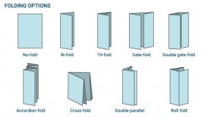
The most common brochures are bi-fold and tri-fold brochures. Bi-fold brochures, also know as half-fold brochures, utilize one fold to create two panels. Tri-fold brochures, also known as c-fold brochures, use two fold to create three panels.

There are numerous other brochure folds including:

  • Gate-fold brochures: These are also called window-fold brochures, where two folds meet in the middle to cover the interior panel.
  • Double gate-fold brochures: Gate-fold brochures with one additional panel.
  • No-fold brochures: These offer one large panel to grab your customers’ attention.
  • Accordion-fold brochures: These are also called z-fold brochures. They utilize four folds that create five panels and open like an accordion.
  • Cross-fold brochures: These are also called French-fold brochures. They utilize one horizontal fold and one vertical fold to create four proportionate sections.
  • Double-parallel brochures: These are also called double-fold brochures. A sheet is folded in half twice to create four panels.
  • Roll-fold brochures: A sheet is folded inwards, starting from the right of the page, creating a minimum of four panels. Afterward, the left of the page is folded over the panels.

Diagrams of all brochure folds presented in light blue against a white background.

The common sizes for a brochure are:

  • 5” x 11”.
  • 5” x 14”.
  • 11” x 17”.
  • 11” x 25.5”.

Should you print your own brochures?

Many people grapple with whether to enlist the help of a company to print their brochures or to do it themselves. Honestly, it all depends on how far you are taking your print marketing campaign. For the distribution of ten flyers around a local neighborhood, you can probably get away with printing your collateral right at home. If you are distributing hundreds of brochures, the more cost-effective and time-efficient option would be to have them done professionally. Plus, there is a level of quality that comes from many printing companies that typical people would have a tough time duplicating, due to the equipment and training needed to produce these expert marketing materials. Often, brochures are printed on durable high-gloss paper to ensure quality.

From a design perspective alone, many websites do offer brochure templates, allowing you to create appealing print marketing collateral using various customization tools. Many personalized business brochures can be customized using tools like Microsoft Word, Adobe Photoshop, Canva, or a number of other programs – some strictly offered by the company showcasing the template.

Brochure templates you can try

Below, you can take a look at some respectable brochure templates and see what each has to offer for showcasing your business’s goods and services. You can click on each image to be directed to that particular brochure template online.
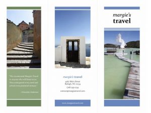
Three travel images including a staircase in a foreign country, a doorway on a cliff-side, and a wooden walkway across the water are presented on this travel brochure template with accents of blue and green. Blocks of white and black text complete the design.
This free brochure template is very clean. It utilizes the bare essentials quite elegantly to display a calm customer service experience and the feeling of serenity received by a business’s goods and services. Combine one great quote from a customer or small enticing body of copy with three evocative images, a cool color scheme, and essential business info, for a brochure that really takes you places. Click the image above to start creating.

Other travel-themed brochure templates that utilize a subtle yet powerful combination of words and images are the three featured below. When taking a look, remember that these are merely brochure layouts and do not have to be strictly applied to travel industries, use them for whatever type of business you wish to promote.
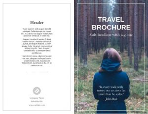
This travel brochure template features one large image where a woman in a blue coat walks through the woods, her back to the camera. Portions of black and white text complete the design.
With the simplicity of one stunning image and a lasting body of text – you can truly make an impact. Add your business name, a tag line, and a thought-provoking quote – and don’t forget your contact info! Unfortunately, this brochure requires a subscription to download, but if you plan on making several more, it’s worth checking out. Just click on the image for product details.
Aerial shot of a large body of water and several islands, as well as portions of white text, make up this brochure template.
You could even stretch one stunning image across multiple panels for a grander visual impression. This particular brochure template example is geared toward conservation, but it would work just as well for travel. And remember, if you have a powerful image completely unrelated to the example provided – use it, it is only the template that you’re selecting; it’s you that decides the industry.
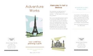
Travel icons like the Eiffel Tower and the Taj Mahal make up this brochure template with burnt orange, blue, gray, black, and pale yellow text.
This brochure template uses graphics instead of images, and it does it really well. A hip color scheme and a balanced use of text and visuals make it a good choice. And best of all, this one’s free! Click for details.
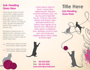
Cat icons playing with balls of yarn and text in hot pink, gray, and black make up this brochure template.
Moving on from travel, but to another great use of graphics – take a look at this fun brochure template. It’s clever, stylish, and will surely stand out to customers. For pet care professionals everywhere this design is worth clicking on.
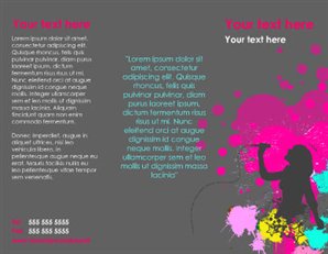
Paint splashes in vibrant pink, magenta, yellow, and sky blue, a silhouette of a female singer, and text in corresponding colors make up this brochure template.
For a splash of color and a crafty use of a simple graphics try this brochure template on for size. Click the image above.
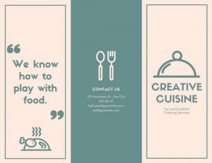
Colors of off-white and pale green make up this brochure template with food icons like a turkey, spoon and fork, and a serving platter, along with two small blocks of text.
Looking for something a little simpler that will still turn heads? This design uses basic icons with subtle colors and a clever tagline to accentuate the business. Of course, you can substitute any of this with your own personal details, but it provides a great jumping off point.
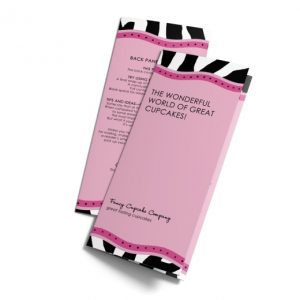
This brochure template features a funky zebra design on the top and bottom, along with a soft fuschia background.
Going for a funkier look? This brochure template uses a zany zebra pattern and varying tones of fuschia to draw your customers in.
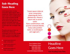
This brochure template showcases various shades of nail polish, focused on tones of red and orange, with an attractive model.
Color is a great thing to play with when designing your brochure. This design uses bold shades and a provocative close-up to capture the theme of the business.
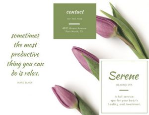
Purple flowers with green stems accent green and white body copy of this brochure.
Head from the salon to the spa, with serene pastel colors, a great use of imagery, minimal text, and a refreshing quote to set the mood.
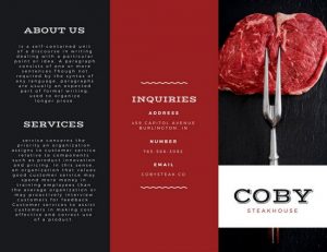
Black and red panels showcase a large uncooked steak held up with metal prongs with white, red, and black text on this brochure that advertises for a restaurant.
For more rich and tantalizing color combinations try something like this. This bold and sophisticated tri-fold uses two, deep, contrasting tones to make the photograph really pop. If you have a distinct color scheme for your logo or brand that you want people to associate your business with, a brochure like this is a great component to your marketing plan.
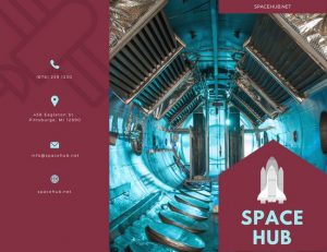
The view inside a spaceship is presented in tones of burgundy, blue, and gray on this marketing brochure.
Here is another example of a brochure that utilizes color very well.
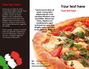
A large pizza-pie and colors of red, white, green, and black are presented on this brochure template.
Something as simple as the template above could also work for you.
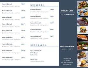
A menu in colors of gray-blue and white features small food photographs, dishes, and prices.
You can also create dual-purpose pieces that showcase your business but also offer a helpful tool to customers, such as a menu like the one shown above.
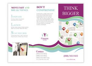
A map graphic and colors of light green, blue, and dark purple make up this brochure template.
You can even create a map of the city that includes your business as one of the landmarks.
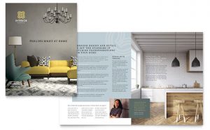
The interior of a nice apartment is featured on this brochure template.
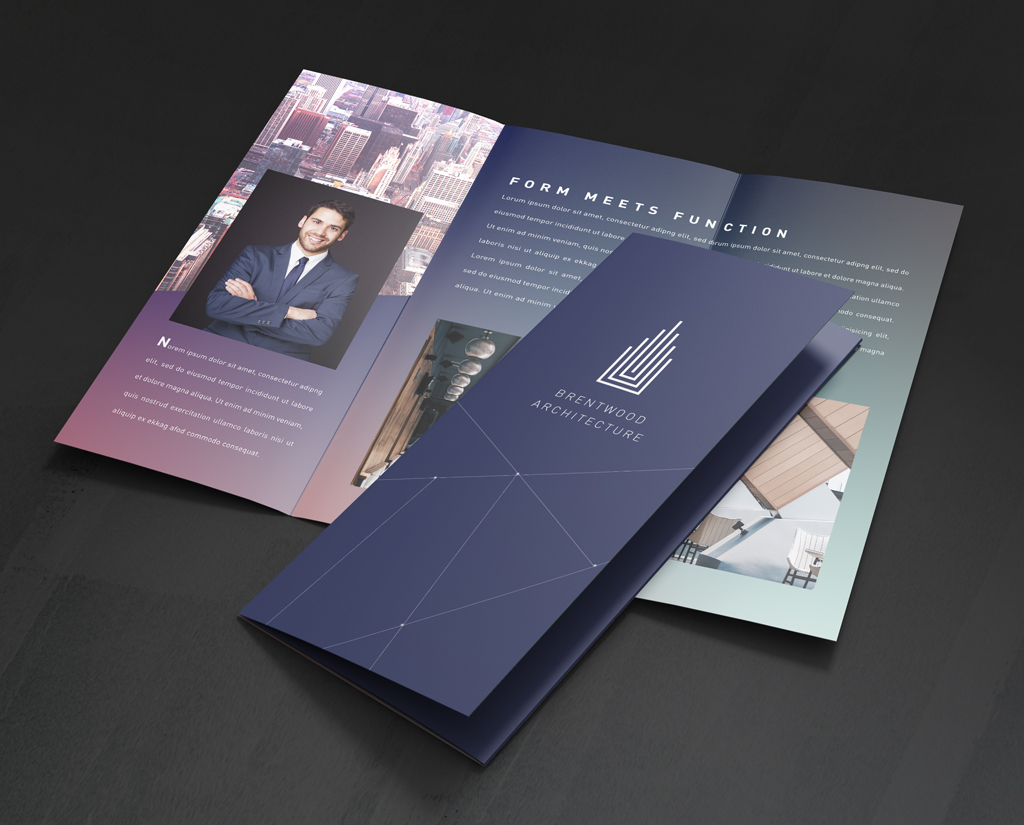
Utilizing depth-of-field to create an immersive photographic experience is a great tactic too – real estate agents and interior designers could benefit from using a bi-fold template with photographs that bring your business to life. This brochure template provides ample space to list out product or service high-points. You can add your logo to the front and include your photograph with a short bio for a friendly first-impression on the inside. Though, this beautiful brochure template does not come cheap with a price of $99.

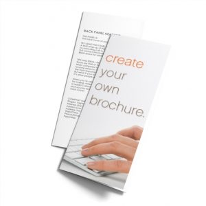
The brochure template features the words 'create your own' in orange and light-brown along with a close-up of someone's hands typing on a white keyboard.

Lastly, if you think you have what it takes, why not start from scratch and design your own? If you have a smart aesthetic in mind, choose the ‘create your own’ brochure template and craft away. Good luck!

2 thoughts on “How to Choose the Right Brochure Template

  1. I have read your blogs on a couple of Brocheres and think your awesome at greeting your points across. Well done
    Thank you
    David

Leave a Reply

Your email address will not be published. Required fields are marked *