
What colors to use is one of the most defining decisions you’ll make in planning your wedding. Your colors will provide a theme to build all the visual aspects of your wedding around – wedding dress accessories, bridesmaid dresses, wedding invitations, wedding programs, the list goes on and on!
Have you been racking your brain for what color theme you’d like to use for your 2013 wedding? Rack no more, because the results are in. Ladies and gentlemen, clear the runway for the Pantone Fashion Color Report for Spring 2013!
According to Leatrice Eiseman, Executive Director of the Pantone Color Institute, the colors for the 2013 Spring and Summer seasons portray a sense of balance. In our lives, we are always seeking balance – a balance between diet and exercise, a balance between work and play, etc. While going about our normal routine, we don’t often think about how color affects us. Little do we know that surrounding ourselves with a wonderful balancing of color can help contribute to a well-balanced life.
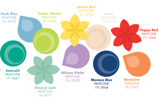
Here is Pantone’s list of the top 10 colors for the 2013 Spring and Summer seasons:
 Dusk Blue: Although blue isn’t often thought of as a natural color, in nature it is the background color to almost everything – such as the time of day when the world is quieting down. It portrays a sense of calm and serenity.

Grayed Jade: Just like the name, this jade color provides a natural feel with its gray undertone.

Linen: This barely there hue has a light and airy feeling to it.

Emerald: This color provides a balance between a natural tone and a more vivid and bright tone. Emerald evokes a sense of clarity and sparkle. It is a beautiful spring color that will be grounding for many other colors in the palette.

African Violet: This floral color is attached to a more exotic feeling and will make for a wonderful combining color in unexpected ways.

Nectarine: This color gives us the answer to where orange has been in the last few years. It offers a warm touch and will be a skin-flattering tone for many kinds of complexions.

Poppy Red: Springtime always has to have some fun shade of red! This color is named appropriately as it really does “pop” out! It will be a wonderful shade to pair with a neutral color and will provide a sense of exuberance this spring.

Lemon Zest: This zesty component will be something sure to make us smile and stop to think of sunshine and good cheer. It will be a great balancing color to use with the more neutral colors.

Tender Shoots: This lively, fun lime color will be an attention-getter that will bounce off the other colors beautifully.

Monaco Blue: This color is the anchor of the entire group. It’s not your typical dark, solemn blue – it’s brightened so that it gives off a sense of cheer, wonderment and calm.
Will you plan to use any of these colors in your 2013 wedding? Let us know by leaving a comment below!