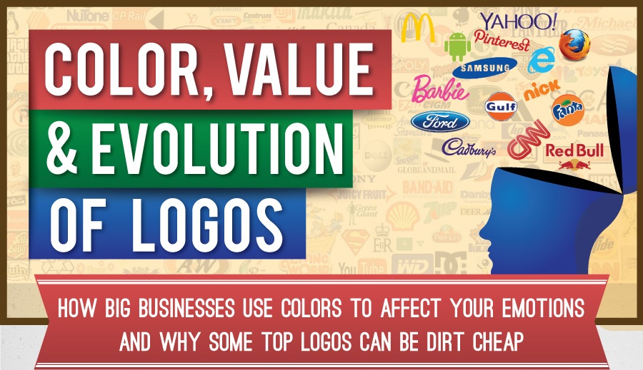
Logos are not just random doodles splashed with the designer’s (or company owner’s) favorite color. They are well studied and follow a set of time-tested design and psychological principles to toy with our subconscious. At least as far as iconic logos go.
Take color meanings, for instance. Ever wonder why McDonald’s is yellow and Red Bull is red? Yellow means happiness, while red evokes intensity. Both colors fit the brands to a tee.
But sometimes the color meaning is not obvious as in the case of Starbucks. Green is strongly associated with nature, while roasted coffee beans are, of course, brown. So why didn’t Starbucks use green? Probably because nature also suggests sustainability, and the coffee chain projects a fair trade position. Subconsciously, the logo color works seamlessly in your brain, reminding you that you’re drinking a feel-good cup of Joe.
That’s how logos are powerful. They talk to your subconscious to influence your buying decisions. Some companies will pay millions of dollars to have their logos created. At one million dollars, the re-branded Pepsi logo back in 2008 is one of the top most expensive logos ever, which include the much publicized 2012 London Summer Olympics. On the other hand, the Coca-Cola logo didn’t cost a cent when it was originally designed by its co-founder, a fact shared by the iconic candy-colored Google logo.
This infographic published by FinancesOnline provides a quick review on the most iconic logos and their color meanings, as well as their costs and evolution.
In the end, logos are not measured by how much they cost or how beautifully they look on a business card or door hanger. The true test of an iconic logo is how long it lasts. And some of the most iconic American brand logos have been around with hardly any change since before grandpa and grandma were born.
Courtesy of: | Author: David Adelman


2 Comments
iwan
May 14, 2014 at 10:33 pmHi, I am a design teacher in an Iinternational School. Is there anyway of getting a copy of this for inspiration for my pupils?
This is very cool.
Thank you
123printwpadmin
May 15, 2014 at 12:46 pmHi, iwan! You are more than welcome to share this infographic online, all we ask is that you give us credit and link back to our site, http://www.123print.com. If you have any questions, feel free to email [email protected]. Thanks!