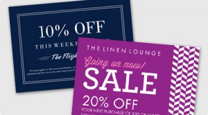
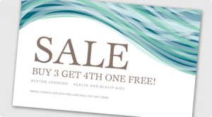
 Sending out a postcard is still one of the most used and effective ways to mass market a message. (Remember — direct mail isn’t dead!) Summertime is the perfect time of year to bring in current customers for a new product or special promotion, or to entice new customers to come out and visit you for the first time. Whatever your reason is for running a postcard mailing campaign, make sure you follow these ten best practices to get the most of it!
1. Use colors wisely. Make sure different colors are used creatively and intelligently throughout your postcard design. You’ll want to incorporate the colors of your branding, as well as the colors of the season if you’re promoting a seasonal offer. Make sure your colors don’t clash and are easy on the eyes.
2. Include photos. Including a photo or two (make sure you don’t get too photo happy) will help prospects establish a better connection with your brand. If your messaging isn’t promoting anything specific, upload a hi-resolution photo of your top product or service in action.
3. Feature your logo. Your logo is essentially your business in a snapshot — it is how customers will make a visual connection with your marketing pieces and you. So make sure it has top billing on your postcard.
4. Keep it simple. Like most marketing materials, keep it short, sweet and to the point. Include just the important stuff. Use eye-catching phrases like “Free,” “Huge Sale,” or “X% off.” Try to stick with just one font. If you have a long explanation of something that you’re dying to share, type it out on your website and include a URL or QR code where prospective customers can go to learn more.
5. Be intriguing. Make sure you’re smart about the info you give prospects right away and the info you want them to seek out themselves — sparking people’s in your business can be quite the art form.
 6. Keep it clean. You don’t want to give anyone a headache from reading your postcard! Avoid clutter and utilize whitespace. Try to match the tone of your postcard’s composition to your audience. For example, if your target audience is business owners, you may want to use traditional colors and fonts. If your target audience is teenagers, you would want to use more funkier and fun colors.
7. Have double the effect. Consider printing on a double-sided postcard to have double the impact! Remember to follow all the rules stated above for either side!
8. Leave room. If you’re designing the postcard yourself or having a graphic designer work on it, remember to leave room for an address and stamp if you are opting to send it without an envelope. If you’re planning on using a pre-designed template, check out some of our designs that will allow you to send sans envelope.
9. Choose the right finish. If the main focus of your postcard is a hi-res photo, you’ll want to print your postcard on matte stock. If the main focus of your postcard is a textual element, matte stock is the better option. When it comes to pt. stock, remember, the thicker the paper stock, the heavier and more durable your postcard will be.
10. Proofread, proofread, proofread. We can’t say this one enough. Double, triple, quadruple check your info to make sure it is correct. Have your friend or eagle-eyed coworker look it over for you, too. Make sure you have at least one way customers can contact you listed on your postcard, so they’ll know how to get a hold of you after being convinced you’re the company they want to do business with upon receiving your awesome postcard!
Have you ever run a postcard mailing campaign? What tips would you have for business owners looking to do their first one? Leave us your thoughts below, or connect with us on Facebook, Twitter or Google+!
