Real Estate Marketing that Tells the Right Story
I covered a lot of luxury real estate marketing in Miami, Florida – for many years. Some industry big-wigs too – one of whom was a featured villain on Michael Moore’s documentary Capitalism: A Love Story. It is of no surprise that real estate is a big deal out there. In fact, when you look around you’ll realize that it’s pretty much all real estate, and if you’re not involved in some way there’s money to be lost.
Before that, I lived in New York City, where undoubtedly the business was just as cut-throat and required a sort of deadly finesse that was all based around how you sold yourself, as well as your gut-wrenching ability to present some slightly-warped version of the American dream. This American dream more often than not resided in a severely overpriced, rather antiquated, and unusually small apartment with a Central Park view.
Recently, I was out in California, where enormously-priced waterfront properties lined the coast; selling for not much less than your first-born child. Yet somehow they were still getting rid of these, and real estate agents were receiving a healthy dividend.
Even in Dallas, Texas, where I now reside, everywhere you look you see new properties with new opportunities to sell. Though wherever you are, in rural Virginia or downtown Chicago, it is possible to become the major contender in your district. You just need to know how to market yourself – to tell your story well and the potential stories of your clients even better.
So where does it start?
Honestly, it starts with the type of real estate agent you want to be – going for the big sales, the multimillion-dollar properties, the middle to upper-middle class homes, or the very dirt cheap properties – and hopefully a lot of them. Do you want to sell residential or commercial? Once you’ve decided, you need to know how to present yourself. If you are selling luxury properties, you better look and act the part; ensure that you are well-groomed, dressed appropriately, and can converse about the subjects and selling points that are sure to peak interest in your market. Josh Flagg, one of the stars of Million Dollar Listing Los Angeles, has all sorts of articles throughout his social media pages on the subject of luxury real estate marketing, but that may not be the route you want to go.
If you are selling to middle and upper-middle class families – be sure you are warm, once again dressed appropriately (business casual may do just fine), and can effectively sell the dream of building a life in a lovely home, townhome, or condo. Sell the dream of raising their children in this home, surrounded by safe areas, lush green parks, and a top-notch school district. In some cases, you essentially must become a family man or woman yourself or a knowledgeable business owner if you are catering to the commercial market. Even if you’re not, mirror the positive attributes that you notice in your clients, make them feel comfortable, worthy, smart, successful, and empowered – especially if they buy your property. And always be an expert in your industry.
Real Estate Tours & Tales
I’ve always admired the initiative of a tour – a guy I worked for in Miami, a former journalist, turned real estate agent, turned consultant, ran bus tours throughout this undeniably picturesque city and its famous neighborhoods. Even if you knew nothing about real estate, it was still a very charming tour, getting a look at the waterways and fancy buildings and homes from the comfort of an air-conditioned bus. Despite your real estate knowledge or lack thereof, this particular agent had a wealth of information to provide, and you couldn’t help but enjoy and even resonate with bits and pieces of his story. The real estate market in Miami – the booms and busts – upcoming projects – recent and old – successes and failures – the history behind the city – trivial celebrity facts – the seedy underbelly – crime lords and presidents – creative geniuses and artistes — philosophers and cut-throat businesspeople. No matter your stance on real estate you couldn’t help but remember this man; he was irritating at times yet somehow charismatic, a fast talker with lots to say, and as a former journalist who still ran columns in popular papers he knew how to weave a tale. He always said that even the best non-fiction had some bullshit in it – that it doesn’t necessarily all have to be true, just interesting. He was also kind of an ass (and he’d be the first to admit and even celebrate this), but people didn’t seem to mind, his persona and effective real estate marketing plan fit the niche perfectly for the luxury condo market in sexy, self-absorbed, beautiful but ever-so-seedy Miami, Florida.
His real estate brochures and other real estate marketing materials were cleverly designed with pictures of menacing cranes looming over the construction of new high-rises – in the sky, vultures swooped above foreclosed properties ready to pick apart what was left and rebuild for a serious profit. This man had made his brand, was committed to following it, and lived for and in its image. When it came to real estate marketing he played the bad guy, but the one you rooted for in movies. His crane logo was featured everywhere, on real estate marketing letters and cards that he mailed, postcards, real estate marketing flyers, real estate brochures that he handed out, his website and social media pages, his presentation folders, his letterhead, and his rack cards. His real estate marketing ideas may not have been for everyone, but they worked as sort of an ongoing script in a period piece that was just as much about its time as its place. He was a pure product of his environment, though he would probably quote Jack Nicholson in The Departed claiming that his environment was a product of him. Now, this isn’t encouragement to become like him, but to instead create a real estate marketing plan that works for you and then live it while presenting your story with the conviction of Jesus reciting the Ten Commandments.
I have another friend that works as a real estate agent down in Key Largo; he wears reef sandals and a Margaritaville shirt to work. He talks about scuba diving, fishing, and boating – cocktails at Snappers and the Caribbean Club – Jimmy Buffet and Barefoot Man songs – he has wildly interesting stories about touring with famous musicians, being chased by sharks while lobster diving, and living on a sailboat while exploring Spanish-speaking islands. His persona is authentic and people down there love it.
When you’re buying a property in the Keys you want to think of lazy days, salty air, frozen drinks, sunsets, and cheeseburgers in paradise, he presented that. He was a polar opposite of The Vulture but had developed a real estate marketing strategy that worked for him. And he got outside to sell his tale. This is an in-the-field job – and whether you’re working or on holiday you are continually meeting prospects – your neighbors, your friends, those you see out and about, the couple sitting next to you at dinner, the dude a row back catching a foul ball at the baseball game, the well-dressed elderly woman at the art museum, someone you bought a used lawnmower from, or shared a secret with, or a drink, or a dirty joke. Everyone is looking to buy or rent property – some don’t even know it yet – hey, we all need a place to live, some of us just a place to vacation, and it’s your real estate marketing strategies that’ll ensure you’re the one that sells it.
Your Logo
Decide on your image and continue. There is a great article about the work and thought that goes into your logo alone; how the font color and simple graphics are so much more, how they can represent loyalty, passion, luxury, family, a steadfast plan for the future, a feeling, a vibe, and an environment, a hip and trendy company or a classic and trusted brand that has been in business for years. Whether you’re selling modern properties, Victorian homes, luxury mountain cabins, or commercial real estate, this must be represented all across the board. An effective logo will help to signify the type of company you are, as you will include it in all your marketing materials, both print and digital.
Digital Real Estate Marketing
I’m not stating something new here. We all know the importance of digital marketing. If I could take us back to a time and place where all business was done face to face, I would. But that’s not going to happen. In knowing this, what I will tell you is that you need to stop being so effing boring with your digital real estate ads, and your print ads for that matter, but we’ll get to that in a bit.
I’m going to start picking apart websites, then move to social media, on to listing sites like Zillow and Trulia, then email campaigns, YouTube videos, and lastly retargeting ads; discussing my loves and hates. After my digital assessment has resumed, we’ll venture into print marketing, outdoor marketing, and finally some tips you can apply out in the field. This is a thorough guide that covers A LOT of information – feel free to skip around.
Websites
I combed through real estate websites in Dallas, Miami, and New York City. While I found some really great stuff, there was also a lot of crap. See what the pros are doing right and what the JV real estate teams need to learn below.
Better Homes and Gardens: Home City: Dallas
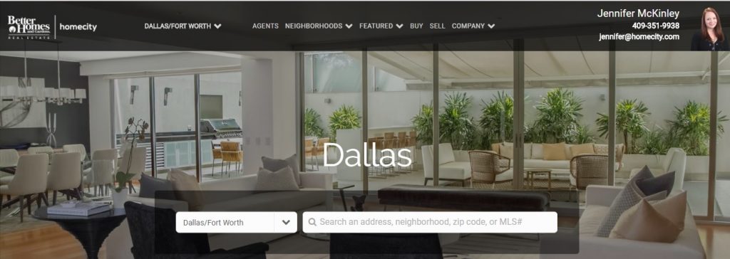


This Better Home and Gardens website has a top image that even though predictable appeals to our draw towards luxury homes – to the point where saying “you have a beautiful home” has become a cliché. The website went on to talk about how they had won awards for the best place to work – don’t care – as long as your agents find me a great property I don’t care if they have a popcorn machine in their break room or work twelve hour days standing on their heads – it’s not about them – it’s about what they can do for me. The website did do an “as seen in,” citing periodicals like Entrepreneur Magazine, Money, Fortune, and Bloomberg Businessweek. That caught my eye far more than their sweet little best place to work awards – these were major publications that gave credibility and ensured that this agency was worth talking about. What really made it for me, though, was their visual representations of the various areas of Dallas. Each of the 24 different communities where they were selling properties was represented by an image – you could click on the image to see the particular properties in that area. All the images presented a vibe, some I knew, others I didn’t, but all sold a dream of what it would be like to live in that area with just one simple image. I wanted to know more.
Alix Prins Real Estate: Dallas
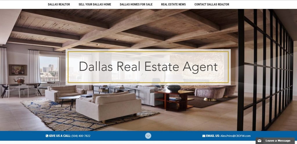
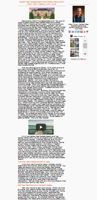
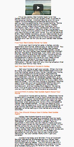
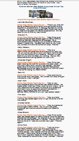
This website did nothing to take me out of the humdrum of sliding real estate pictures. A lot of text presented in a small, bold, and unwelcoming font. I’m an avid reader, but I was exhausted just looking at all that text. I’m sure he’s a very capable real estate agent and a nice person, but his website put me to sleep.
Better Homes and Gardens: DFW
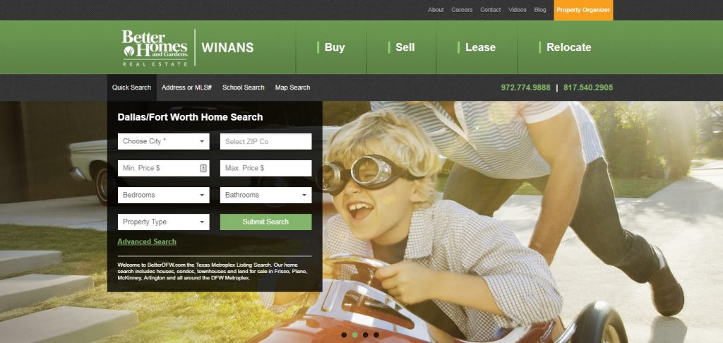
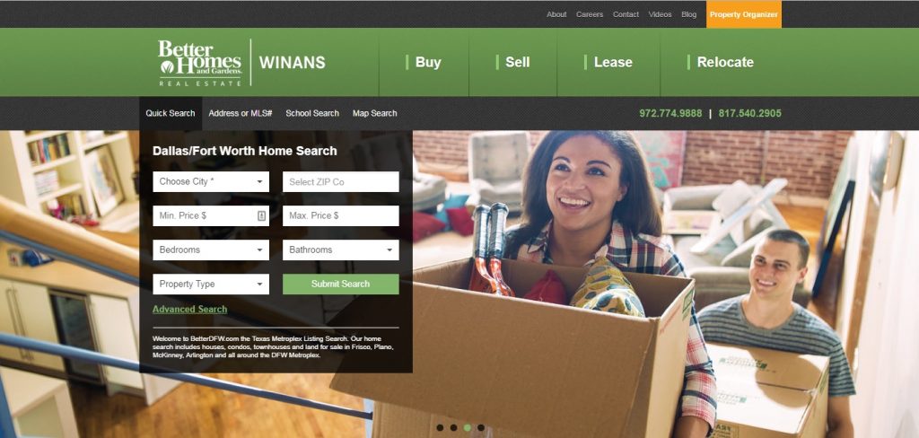
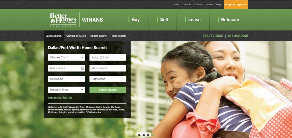
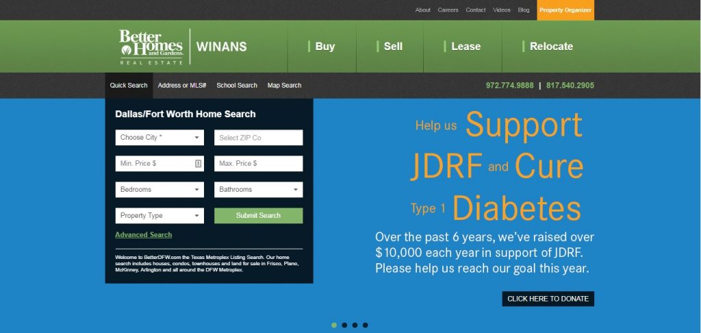
This is the second Better Homes and Gardens website I came across. In fact, I didn’t even realize until catching a glimpse of their assuring logo, which was far more prominent on this site than the other one. It looks like they are doing their best to dominate the market in Dallas.
I actually like this website better than the first one I reviewed – they didn’t feature any of the typically expected property shots in their slides. Instead, the slides included a fun picture of a little boy wearing racing goggles while his father pushes him in a small toy car, an interracial couple carrying boxes up the stairs that are filled with things representative of their hobbies and home décor tastes, and an Asian mother and daughter hugging each other – excited and smiling. Each told a different story and made it seem like you could be their next success. They also showed their charitable side by talking about the money they had raised in search of a cure for diabetes and how you could help. They did a good job of making themselves seem like a warm, friendly, and conscientious family company. Additionally, they made it super easy to enter exactly what you wanted for your next home with specifications including property type, minimum and maximum price, bedrooms, bathrooms, and city.
Josh Stein Realtor: Miami
 This website is sexy, hip, and eye-catching. It may not work everywhere but it certainly works for Miami. The young beautiful woman is empowered, on top of the world, and ready for a new luxury condo in a waterfront high-rise. They even give you an option of quickly viewing the top 25 condos in that area. Look at the featured colors. The sun is setting and the exciting lights of Miami are starting to glow. The woman is all in black, including black sunglasses. The predominant tones around her are violet and magenta with pops of white – these tones are repeated throughout the entire page. The violet represents wealth, luxury, ambition, creativity, and independence. The presentation of the magenta-like color induces a playful, passionate, and sexy quality of the trendsetter who creates their own path, who is transforming, who is turning their ambitions and desires into a very vibrant and exciting reality. The color black is powerful, indicative of the modern woman who wears it. The effective use of white paints a very visceral feeling of success.
Josh Stein’s logo features a fresh look with magenta and white. It also includes a white back-glow, like the flash of a camera at a celebrity event, perhaps inspiring the idea that you’ll be a celebrity too if you buy with him – deserving of the same luxurious lifestyle. Maybe this idea is a bit hokey, but it is still presented effectively here. The tagline reads ‘Let’s explore Miami together’ in white, with an arrow pointing down leading you to the next slide – what could it be?!! The website really presents all the mysterious and exciting possibilities that are waiting for you when you choose Josh Stein as your realtor. His real estate listing marketing plan is meant to tap into clients that have bravado or at least think they do.
Compass: Miami
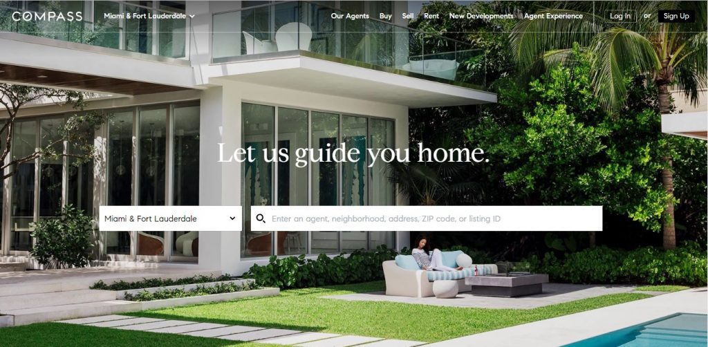
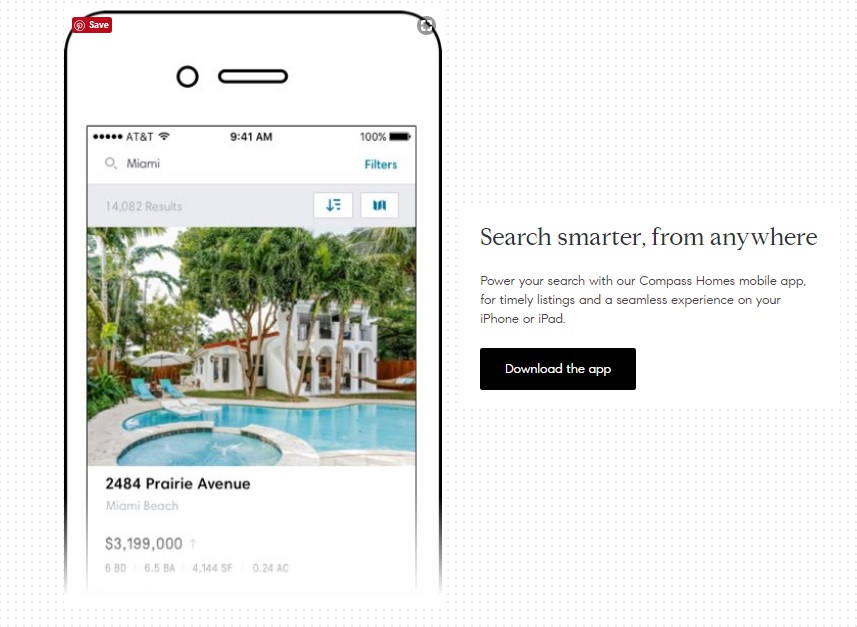
Compass’s website is clean. It features modern and chic tones of white, black, and green, with soft touches of blue – representative of the famous blue waters in Miami and Fort Lauderdale. Compass has a pretty well-known logo that has been examined on at least one other real estate marketing blog. It is strong and trustworthy in capital white letters shown above – clean, just like the site, and points to success. Featured in the ‘O’ is a subtle compass needle. The tagline reads ‘Let us guide you home.’ in white. The period at the end of the word home shows that you are already there and relaxed – you have found your piece of the American dream. You imagine sitting in the pristine luxury homes that they are selling. True, it features that same predictable property shot at the top, but their homepage is easily maneuverable, uncluttered, and pure, just as you imagine the experience to be. Toward the bottom of the page, they showcase their mobile app by featuring a cellphone graphic with a beautiful property included on the screen. The tagline reads ‘Search smarter, from anywhere’ – it has a nice ring to it, doesn’t it?
Abraham Ash: Multivest Realty: Miami


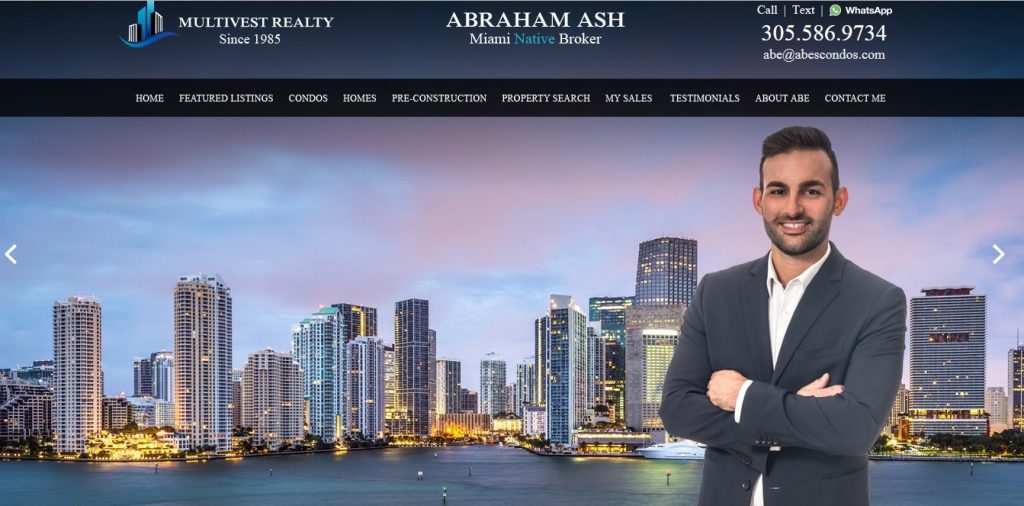
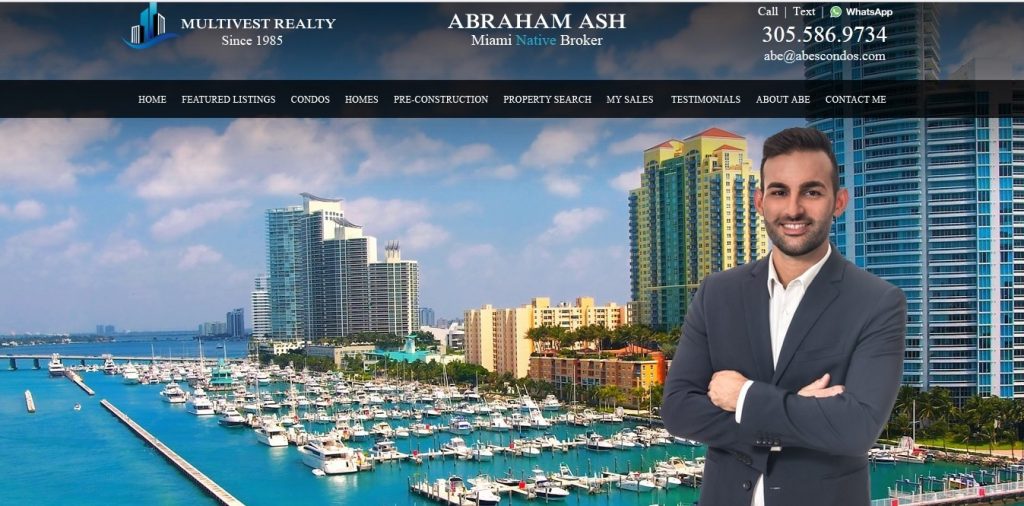

While the homepage is just so-so, it does have a couple of things going for it. One, the Multivest Realty logo is pretty well-done; it’s sleek, a bit fun, and hip, just like the city and the young agent working for you. Though, it does possess a relatively timeless quality that could still work many years down the road. The logo may not have quite the same effect in black and white – but it still wouldn’t be misunderstood. The logo has a multi-toned blue wave that rolls up for an excelsior-like symbolism, and the two high-rises in the center reflect the azure waters all about Miami with smaller but assuredly nice buildings on the outside done in black and white. The name of the agency ‘MULTIVEST REALTY’ is presented with strong, capital, white letters. ‘Since 1985’ is spelled without the dramatic capitals and a little smaller. You get that they are fairly successful being in business for over 30 years, that they are all about the city and properties they represent, and ready to help you find your next home in that beautiful city. The slider features various stunning shots of the ocean and bay around Miami with the properties towering overhead – yes, more property shots, but they are a real estate agency and with an area like Miami these images kind of sell themselves.
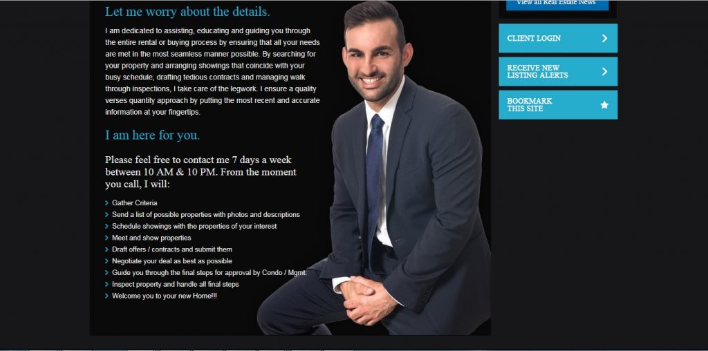
To me, the points off go to unoriginality and the fact that Mr. Abraham Ash looks pretty corny standing against the backdrop of those images. Plus, he’s kind of doing this arms-folded self-hug thing, as if he doesn’t know what to do with his hands. Depending on how you cross your arms, this type of body language can illustrate a cold or defensive stance, though the self-hug in the case of Ash shows a weaker, anxious, and more insecure body language – these are traits you don’t want perceived as a real estate agent who is selling a home in a highly competitive market. He does gain points for the list at the bottom, detailing all the things he’ll personally do for you, but still, I’m not sure I’m convinced.
NYCRS: New York City

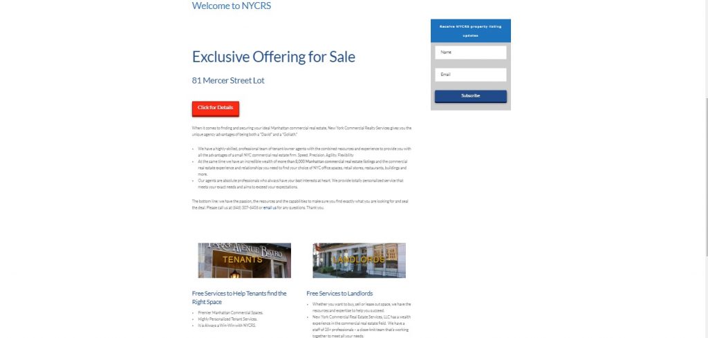
Here is a commercial real estate service in New York City that received one star. In my opinion, most people aren’t going to be dumb enough to even click on their website, but I was curious what it looked like anyway. I wonder if a buzzer is going off in their office right now signifying that they have received their first visitor in over a month’s time. I hope I didn’t get their hopes up too high. Let’s see…their logo is dry and does seem a bit outdated. Their website doesn’t really stand out, even with the larger-than-life yet all-too-predictable New York City skyline. More so, their website is very thin, it doesn’t really have any meat to it. Mind you, this is just at first glance, but if you don’t make a strong first impression, then the sale is likely lost. The featured color of blue is meant to represent trust, loyalty, and stability, perhaps even intelligence, but if this were true they would have known to put a little more work into their website and to do something about that one-star rating.
Philippe Choplin | Douglas Elliman Real Estate, Agent Immobilier New York

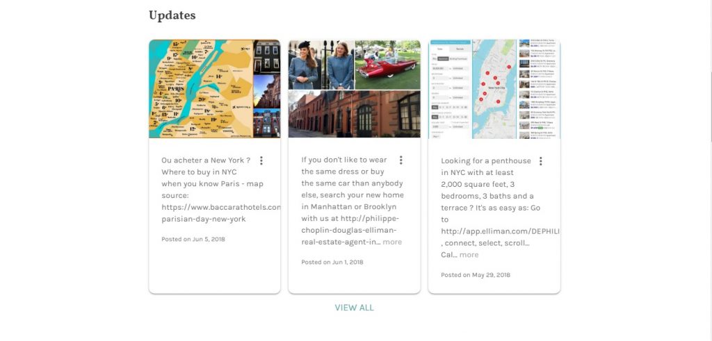
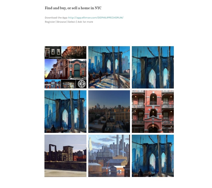
Here’s an agency that received favorable reviews. Wow, what a breath of fresh air for the header image – using a fine art approach to present New York City’s famous Brooklyn Bridge. They also use a lot of blue. I find myself being drawn to and respecting a company more that would take such a unique and beautiful approach to presenting their city. The image shows that they hold great value for New York City. The white font they chose reminds me of vintage lettering that you would see in an old-school NYC newspaper or magazine publication, indicating a vast history behind their brand. I found the text in their updates intriguing as well, not the same old news. My points off go to the fact that the website required cookies. Additionally, I was met with confusion regarding a block of clickable images towards the bottom of the page. The block included more fine art renditions of the city, but for what purpose I wasn’t sure, and when I clicked they just led to more images without explanation. Oddly enough, I also did not see a logo accompanying their company name and the long stream of words in the upper left corner was kind of an eyesore.
The Corcoran Group: New York
 Lastly, I took a look at The Corcoran Group website, as in Barbara Corcoran of Shark Tank and her successful real estate agency. Barbara Corcoran had endorsed some of my current company’s products, talking about their use in her marketing efforts, so I had gotten to know her bold personality, vast knowledge of the industry, and eye for style quite a bit – the website for The Corcoran Group is of no exception. Featuring the stylish NYC black and pure white indicative of a high-end wedding – the site was fresh, clean, modern, and stylish. The name behind the brand, Corcoran, was written in an ultra-chic white script font against a black background. There was an accent line featured underneath in elegant tones of silver and gold, optimistic yellow, and a darkening gradient of metallic orange – bringing warmth, creativity, and feelings of success to their potential buyers. The first slide had featured text that simply said ‘Be Home’ with three young, stylish, New York women laughing and celebrating. One woman was using the bubble wrap of her very recent move as a scarf and hat – she held a glass of champagne. It was a story with real relatable characters – the lively and humorous use of bubble wrap made it quite distinct. There was even a link to an interesting story. The words ‘Be Home’ were finalizing – you were already there – laying the last box down in your new place. At the bottom of the homepage was the Corcoran name again written in that same stylish white script font with a tagline underneath that read ‘live who you are’ – in other words, be yourself, and choose a place that defines you and your utter uniqueness. This was the brand that was going to help you do it. Of course, if you had at least a million to spare. But the high-price point of luxury real estate is marketing in itself – when people buy million dollar Manhattan properties they feel undoubtedly exclusive.
Social Media

Almost everyone is on social media. Remember that the majority of homebuyers shop online. Command a presence and tell a story that everyone can share.
Facebook lets you engage with your clientele – so it’s pretty necessary to continue the story. You can take a fun conversational approach or one that is more professional, based on the type of company you are. Show properties, communicate with friends, present a lifestyle indicative of the clients you are targeting – local hot spots, food and drink, arts and entertainment, home renovations and décor tips, and more. What are the things that your city has to offer your customers, and what interests might you have in common?
Instagram is perfect for real estate agents. It commands a younger social media presence. It is great for millennial homebuyers who, at about 10% above baby boomers, do approximately 94% of their home searches online. It’s also photo-centric – a great place to display your stunning properties and even videos – just make sure they look good.
You can take to Twitter to promote listings. On Twitter, and really any of your social channels, you can also offer home renovation tips and décor suggestions for your real estate marketing plan. You can even make Twitter your customer service hub.
LinkedIn is the perfect professional channel. The use of LinkedIn can help boost your reputation, as people who are happy with your services have the ability to endorse you. It’s great for networking and expanding your reach. You can also share your informative blog articles, whitepapers, and other relevant posts for your industry and market.
Rules of Thumb
Post consistent quality content and it should be worth your time – be sure to include images and most certainly videos. You can also use software like HootSuite to schedule your posts. You should continue to examine your metrics to measure what channels and posts are most effective and then act accordingly. Attempt to engage with customer comments, whether negative or positive, on a regular basis – it will help to show you care.
If you would like to take a look at some badass social media pages for the real estate market, check this out.
Zillow, Trulia, and More
Zillow now owns Trulia, and although they will operate as two separate entities, at least for the immediate future, they are working to create one shared database for all listings. For you, the fact that they remain as two separate brands gives you more opportunity to advertise your listings. While Zillow presents itself as strictly real-estate-based and Tulia provides more information about living in a community such as crime rates, schools, and surrounding areas, they both offer solid sites to consider promoting your properties. Zillow and Trulia also reign over all other listing sites in the industry. The cost of advertising properties on these two sites differs from state to state and even neighborhood to neighborhood, higher-cost homes in higher-cost areas equal higher-cost advertising prices.
Coming in third place for the highest-trafficked site in this niche is realator.com. If you are looking for alternatives, this Investopedia article provides more details and describes additional options like:
- Redfin
- Homesnap
- Neighborhood Scout
- And more.
Email Campaigns
Build your list. Build your list. BUILD YOUR LIST! Offer the option for email signups on your website with the promise of exclusive offers, insider information, informative articles, the latest industry trends, or a killer promotion – and deliver on your promise. You can use a program like MailChimp to schedule emails, e-newsletters, and content shares for your entire list. Send email campaigns with attention-grabbing subject lines and equally striking news inside – with great written, visual, and multimedia content, depending on the ad. Be funny, be bold, be daring, be controversial to industry norms, be a trendsetter, be exclusive.
YouTube Videos
Sotheby’s International Realty® does video after video that showcases these truly unique customer stories. The videos tell these captivating tales about truly distinct people and how the properties work to further their inspiration. There is one of a painter, one of a chef, an entrepreneur, a husband and wife photographer team, and more. It’s their stories coming to life in and around these properties, and in turn, it brings the properties to life.
Retargeting Ads
Honestly, retargeting is cyberstalking but with ads. Don’t get me wrong, there’s nothing actually sinister about retargeting, and it can be pretty effective. Let me explain. Someone comes to your real estate website, looks at a property, and leaves. With retargeting you can remind them, no matter where they go online, throughout the days and even weeks, that they looked at that property.
Also, if a visitor hasn’t been to your site in 30 days or more, retargeting is a great way to remind them that you are still out there and ready to help them find their next home or commercial property.
Google is completely self-service, but you can use retargeting companies like ReTargeter, Perfect Audience, SteelHouse, AdRoll, or Criteo. You can feature a digital ad complete with a tagline, striking images, and a link back to what your prospects viewed across the internet and their social channels. As your prospect surfs the web and looks at other things your ads will follow them and pop up on their screen. With the right ad, and depending on how zealous your prospects are in their search for real estate, retargeting can be effective or it can get super annoying. Remember to set the frequency of these ads relatively low so you aren’t constantly in someone’s face. If you pop up here and there – fine – but too much and you will lose that potential client.
You can offer promotions with retargeting or follow users who abandon your site. It’s also good for lead generation – you can entice people to sign up for your email list or give you a call. You’re unlikely to see immediate results, but over time it could help to increase your bottom line. Remember the little things:
- Micro-conversions
- Traffic
- Visibility
Segmentation is important because you don’t want to waste money or annoy users who aren’t in the corresponding stage of the purchase cycle. For example, you don’t want to show a sales ad to someone who just bought a property. Instead, you can use a branding ad and time it so that they are reminded of your brand while seeing ads for competitors. Keep in mind that competitors will be using these same tactics.
There are many services made for all types of businesses that can either manage your campaigns or allow you to use their tools for self-service. Most businesses who want to manage their own ads would use Google AdWords because it allows full control over the creative, targeting, and ad spend. AdWords makes it easy for anyone to make an ad; the hard part is segmenting the campaign(s) to align with your goals, and finding what works. There is an ad format in AdWords called “Responsive Display Ads,” which will automatically resize to fit many different ad sizes and placements – all you have to do is fill in the text fields and upload some images. The responsive ads can even showcase products in a grid based on what the user previously browsed on your website. This is a common ad format for companies with large product selections. Or, you can design your own HTML5 ads and upload them to AdWords. These can be static images that link back to your website, and you can include promo codes and/or specific calls to action in these ads. With AdWords, you can set the ad frequency at a campaign level – this means that an ad will show to a user only a set number of times per day.
If your goal is sales, then you can measure clicks on the ads that lead to a purchase. If your goal is lead generation, you can measure clicks from your ad to email signups or phone calls. If your goal is branding, you can measure the number of impressions and number of times an ad was viewed per user. It is really up to you on how to measure and what you consider to be more important.
Print Marketing
Yep, it’s got to be there, and in fact, for real estate marketing, print marketing comes in handy. You are meeting clients and potential clients all the time, so you’ll want top-notch print marketing materials to hand to them. Really, this is a whole bunch of things, starting with your business cards.
Yes, you still need a business card. You may look at a business card as a caveman form of contact exchange, but it’s still how we do it. You are going to look seriously unprofessional if someone asks for your business info and you say “I’ll text it to you.” If someone asks for a business card and you don’t have one, you look even worse. There are various forms of business cards – small ones, really big ones, magnetic ones, funny ones, clever ones, classic ones – just know that you need something – and remember these four rules of thumb:
- Legibility – Choose an easy-to-read typeface like Serif or Sans Serif fonts typically in a point size of six or above.
- Eye-catching – Make sure it’s memorable in some way. You want it to be nice looking and to stylishly represent your business.
- The style of card you choose should be representative of your type of company. A quirky company deserves a quirky business card. A more traditional company needs something very professional and gives prospects a sense of security – that they are working with a longstanding and highly experienced company.
- Don’t go cheap – You’re in a business where a business card really matters. Don’t buy some flimsy piece of crap where the ink is always smudging – it will cost you clients. Spend a little more to make a lot more in the long run.
Be sure to include your logo on your business card. Showcase all contact info; including phone numbers, email, your website, and social handles. You can also add a clever tagline, a photograph, what kind of properties you deal in and in what areas. If you choose two-sided business cards you can include special services you offer, why your company is unique, a larger logo, or an enticing photograph on the back. I’ve written a couple of pretty in-depth articles about business cards that you can check out. See below.
- Which Business Card Company has the Best Deal?
- If You Think You Don’t Need a Business Card…You’re Wrong
After your business cards, think of other products that you are likely going to need. Real estate brochures are an excellent way to showcase services and offer a very image-centric format to present the beautiful properties you sell. You can check out this article about choosing the right brochure template.
Many successful real estate agents recommend sending out greeting cards to your clients – and this is never a bad idea – birthdays – holidays – thank you notes – come to our open house for free champagne and fish tacos – sorry your grandma passed – a wedding – a baby shower – how about congratulations on your new home? I’d appreciate that one, and certainly consider recommending that agency or agent to a friend.
Brand everything with your logo including the greeting cards. Brand the envelopes. Brand the stamps and address labels. Use personalized letterhead and presentation folders – create refrigerator magnets – heck, magnets for your car – pens. Hand or send out branded real estate postcards or rack cards with news of an open house or special offer.
I am now going to drop in three shameless advertisements for companies that I work for, but there’s an upside, they can really help with your marketing efforts. Looking for business cards and other print marketing pieces that are far better quality than Vistaprint’s flimsy products with the low-grade color printing? Yet still at prices much lower than the pretentious MOO? Try 123Print. Don’t believe me? They offer free samples. Try them out yourself. How about business greeting cards to show clients and colleagues that you care (even if you don’t)? Try CardsDirect, or for a more classic look try Brookhollow. You can customize with your logo, signatures, graphics, your sexiest real estate photos, and the right text to sell your properties. Free samples also available. Hell, I’ll even send some promotions your way.
- 123Print Special Offers
- 15% off Sitewide at CardsDirect with Email Sign-Up (Lots of Additional Perks When You Sign Up!)
- Free Ground Shipping at Brookhollow (Additional Offers on Site!)
Print Ad or Article
You can also feature a print ad in a periodical or write an article that qualifies you as an expert on an interesting subject in the real estate market. Print media is not dead and, in fact, many people trust it more. The ads or content also tend to resonate longer for its readers when compared to their digital counterparts.
Outdoor Marketing
It’s time to get outside and use some proven old-school tactics to command the attention of your target market. Take a look.
Car Magnets
Do you drive a car? Car magnets or wraps with your photo and information may be a good idea. Car magnets are cheaper – and you can take them off if you have a hot date then put them back on. Trust me, your date does not want to see you roll up in a car that is permanently wrapped in your real estate ad – it’s a mood killer.
Billboards
Next, billboards, yay or nay? Well, if you have a good one like this, I say yay.

This is actually a large bus stop advertisement – which on busy streets and routes can also be quite effective, especially because it gives a chance for prospects to linger longer and digest your ad in its entirety, in some cases causing it to resonate more.
If you’re going to pay billboard prices, make it count. Set up shop in a high-traffic area and make it super engaging. Honestly, there are great statistics surrounding billboard effectiveness – check out this article from Forbes.
Real Estate Yard Signs
You are definitely going to need real estate yard signs too – to stake your claim so to speak. Here are the properties you are selling. Here are the properties that sold. And here is who they were sold by. You! Include a flattering photo and your contact information. And for unflattering photos, there’s always Photoshop.
Banners, Booths, Tours, & Community Events
Host or be a part of community events. You are selling to your community. It’s your properties in that community. Celebrate with these people. Get to know them. Set up a booth. You don’t necessarily need bus tours, but Jeff Goodman is a luxury Manhattan real estate agent that does neighborhood walking tours throughout the legendary Gramercy Park. Feel free to do this in your city or town, even in a small neighborhood – and what better way to showcase the refreshment stand at the end then with your custom banner. There are charitable events, marathons, walks for cures, Fourth of July barbecues – just get involved. Put an eye-catching banner above that booth. Provide free swag bags with fun branded products like a keychain, bottle opener, or corkscrew – you’re not promoting drinking and driving here just giving out products people will use. When I moved into my last property there were branded wine glasses with the name of that property and champagne waiting for me, not a champagne person, but I appreciated it just the same.
Marketing flyers
Flyers work great for outdoor marketing; hand them out at community events and leave them at popular local establishments. If you are going to place them on car windshields, you better make sure that that your ads are clever and enjoyable or this can get annoying real fast.
Real Estate Door hangers
Strategically placing real estate door hangers around your city and its neighborhoods will let potential customers know that you are there to help. On the right day you’re sure to catch people that are actively looking for real estate and now they have your contact information at their fingertips. You can even include a photo of yourself to make it more personal, customer reviews, and a nice message.
In-the-Field Marketing

You see this property? It is actually in a 51-story building called the Olympic Tower in Midtown Manhattan. What stands out to you? What do you notice even before the incredible view? Yep, that odd looking couch. Love it or hate it, you won’t forget that property, because it has now become the property with the weird couch…and the incredible view. You don’t always have to be as ostentatious as this, but when presenting a property make sure you have something that stands out – a neat rug, a unique sculpture, or some other type of conversation piece.
The little things are also important.
One subtle but very important detail can be a smell. If your property smells great people will remember. Successful real estate agents use scent marketing all the time. Even many years ago agents use to bake a batch of cookies before clients arrived to make the house seem cozier – then guests would also have something to eat. Pick a nice scent that is not overpowering and make sure it does not go against the season. More refreshing citrus scents are better for summer and warmer weather whereas spices like cinnamon, for instance, may work better in autumn or winter. Think about a pumpkin spice latte – it just feels kind of wrong to drink it in August, like smelling evergreens in a home before Christmastime. Some scents can make people feel enclosed whereas others remind them of wide open spaces. You can also choose something a bit more unique to scent your properties in order to stand out – just make sure that it’s pleasing. Check out the article Does Your Company Have Marketing Scents? for a comprehensive look at how largely effective scent marketing can be for your real estate business.
At its core, in-the-field marketing is just interacting with your clients, colleagues, contacts, and really whoever you meet. Go to networking events and tradeshows. Learn as much about your market as you can. Become an expert in your field and share this knowledge with other people. Talk to people on the subway and out and about. Fine-tune your social skills, because the more you learn how to connect with people the more ability you have to sell the American dream.


Enjoyed reading all the information and great tips. Always on the look-out for articles like this, thank you. For a good online resource for folks looking to relocate to the area of North Texas, specifically Denton County – https://denton-realestateagents.com. This online directory will connects folks with the best real estate agents who are familiar with areas including the Texas cities of Denton, Corinth, Argyle, Lantana and others.
Wow Really Very nice post Such a useful information thanks for sharing
Keep up the great work! Thank you so much for sharing a great posts.